Jim Kacian
Looking and Seeing: How Haiga Works
Of all the contributions to world art to have come from the Japanese, haiga is perhaps the most unique. It is, by definition, a combination of visual and verbal elements which work in ensemble to create an aesthetic experience quite distinct from either element taken by itself. This combination of pictorial and poetic materials is rare in any culture, and especially so in so-called “high” culture: besides haiga, other such combinations would include captioned drawing (most often humorous), comic books, posters, calligraphic art, print and television advertising, graffiti, the work of a very few western artists such as Roy Lichtenstein, and not very much else.
Which we might consider surprising given that the visual and the verbal are the two most powerful and frequently employed elements of communications. But for just this reason, perhaps not, since each is so powerful in its own right, and so demanding of attention, that it can prove ineffectual to combine them; similarly, perhaps the overlap between the two might be considered a distraction from either. Whatever the explanation, there is very little history to such a combination in art.
All art has a set of conventions which an audience must know in order to appreciate the work. The ease of acquiring these conventions is how we determine if a work is “accessible” or “difficult”. When the art form is combinational, then a combinational set of conventions must be employed, which can complicate accessibility. Let’s consider some of these forms just to see what the artist and/or author has done, and what his expectations might be.
In this first sample, a political cartoon by Sempé from 1965, note how the convention of reading left to right makes it possible to “get” the joke; presumably if the head featured in this cartoon was Chinese, the “poster people” would be on the right side of the panel. The text here provides some information, but adds nothing to “getting” the humor, and the point.

The second sample, from the comic strip “The Adventures of Phoebe Zeit-Geist”, written by Michael O’Donoghue (later a writer for Saturday Night Live) and drawn by Frank Springer, and published in Evergreen Review in 1962, employs a figurative means of distinguishing speech, say, from narrative. Is it apparent how to read these—that is, do we know what is dialogue, what not?
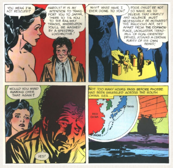
Do we know what order in which to read? How do we know? It is apparent, too, from these cels, that the artwork from panel to panel may be discontinuous. Multiple angles and views reflect the influence of cinema.
In the third, a poster from the Russian Revolution by an unknown artist in 1919, the power and orderliness of the text is underscored by the horses, symbols of domesticated power, brought up to the mark by their human riders.
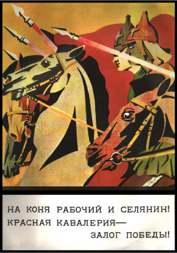
“Mount your Horses, Workers and Peasants!” the poster exhorts, and the unity of the “goal” is seen to be compelling enought to unite horses and even men of decidedly different breeds and ethnic origins. A powerful message in a brief compass.
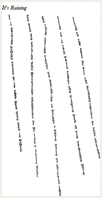
Another combination of text and art is calligraphic poetry. Depending on the work in question, these may feature the text, or the image, or find a balance between them. This example is Apollinaire’s “Il pleut” translated by Oliver Bernard and retaining the shape of the original. What’s particularly of interest here is that this is a typeset shape poem, unlike most, which are hand-calligraphed. Apollinaire was taking advantage of some new advances in typography which make precise position simpler to do. In this instance, the text is supported by the typography, and while it could stand in a more typical stanza-ed format, it is clearly enhanced by the present treatment. And perhaps we could allow that the art herein presented might stand on its own, but admittedly it would be fairly meagre. Apollinaire and other poets as well have, at many times in the history of poetry, also produced shape poems in the likenesses of cannons, bells, wings, and many other motifs which echoed the content of the poems, though only occasionally have such efforts improved the outcomes.
This fifth image is a deliberate attempt to utilize text as a focal element within painting. Magritte’s “The Two Mysteries” intentionally blurs the line between that which represents, and that which is represented. There have been many other analogs in other arts: John Cage’s 4’33” during which the audience participates in a musical ‘silence’ leaps immediately to mind. In the present work, this painting relies upon the written text for much of its ‘import’, and as such is as much about reading and interpreting as it is about assimilating visual information. Which is both like and unlike haiga, as we shall discover.
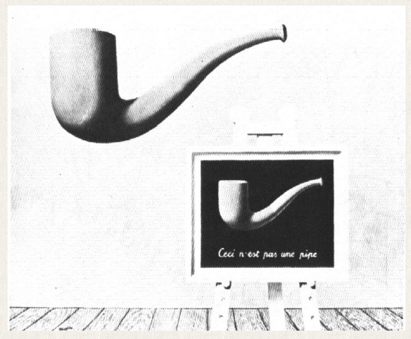
The degrees of abstraction utilized in all of these examples is considerable. None attempts a formal realism. All rely upon the audience’s willingness to grant “artistic license” to the illustrator so that the point might be made the more quickly. All, we might say, intend an immediate apprehension of what is of value in the work. We do not pore over the drawings, or even the painting, as we might over a painting which intends to realize its full intent through strictly visual means. All of these rely upon our translating the events into sense within ourselves, unlike, say, a Rothko, where the intent is clearly non-informational, at least on the verbal and cognitive level.

Here we are invited to dwell in the emotional waters of color, and no “interpretation” on a verbal or rational level is needed, or sought. Compare this (admittedly extreme) example to the other work we’ve looked at. In the cartoon, there is a predominance of interest in the visual aspect; in fact, we could do away without the text altogether. It functions rather as a caption, a tag with which to handle it. In the comic strip there is a more equal emphasis, with the verbal element carrying forward the narrative and the drawing adding richness and often humor and sexuality to what would otherwise be rather dry and insipid dialogue (in fact, it is the juxtaposition of these elements that make for the particular appeal of this strip). In the poster, even the convention of depth is subjected to a powerful stylization, and the text is an explanation of the image as a commentary, quite outside its visual interest in its own right. The exhortation would seem rather sterile without the power of the graphic, but the graphic holds interest on its own. So again, the verbal element could easily be excised in this case, but is not because the painter needed to make an intellectual point quite beyond the visual information already supplied. In the Magritte, the text sets up the parameters, the conventions, if you will, of how the picture is to be understood: that is, as an intellectual conundrum, as all art is. And in the Apollinaire, the one informs the other, while not being totally dependent upon it.
We might further consider the combined art and text used in advertising—“It’s the real thing” accompanied by a swirl of color, suggestive of a wave, is a good instance. These often attain a level of artistic interest, but it is clear that their intent is not this beauty, or at least not primarily, but rather, an appeal for quite other purposes. I have not, as a result, included such work here.
Nor have I included any captioned photos. The intent of such work clearly is to have the one explain the other. There is no particular expectation that they resonate, but simply share information which is being transmitted. And so I have not included any examples of these, either.
However, the interest there is more on the level, or metalevel, of communications theory, rather than on a binding together of these two elements to create a unified whole. It can be argued, actually, that Magritte’s specific goal was to reawaken us to the casual fashion in which we refer to symbols as the objects themselves, and while this is useful information, it is precisely opposed to what we usually hope to accomplish with our symbols in forms such as haiga.
What about haiga, then, in this context? What does haiga attempt to do, and how can we link it with the tradition of combinatorial art forms as we have just explored?
I think it is apparent that none of the examples we’ve looked at function precisely as haiga does. The humorous drawing, at least in this instance, could have dispensed with the text. However, many cartoons do exhibit an interdependency between visual and textual material, and as such it is perhaps closest to haiga. But even here there are some differences. Most cartoons are humorous, and the text is arch: the intent is not resonance, but irony, and intellectual humor. So perhaps we would consider cartoons to be more akin to senryu, and perhaps we should imagine a new form of haiga, perhaps to be called senga, which treats this sort of material.
The others share some points, but lack others. For instance, the comic strip has a balance of interest between visual and textual elements, but features narrative, which is clearly outside of the purview of haiga. The poster is hortatory and hyperbolic, whereas haiga, at least as it has been practiced traditionally, is usually understated and seductive. The Magritte and like paintings aims more toward the intellectual than emotive or intuitive, and as such are perhaps more linked to philosophy to art. And the calligraphy art, at least in this case (and in virtually all others I know) is severely limited in its visual expressiveness, and as such does not offer a fair opportunity for true balance of elements to emerge. So haiga’s uniqueness remains, partially due to its unusual juxtaposition of art and text, and also partially due to its intentionality.
It is this intentionality that I wish to explore today, and specifically how this intentionality informs the conventions by which we interpret it, as well as the parameters by which we create it. As haiga becomes more assimilable in the west, it will be through this sort of interpretation of cultural modes that we will come to discover what place it holds in our perspective of art, compared not only to other haiga, but to all other forms which we encounter.
In order to do this, we need to talk first a bit about haiku, as well as make a critical distinction in methods of viewing which is critical to the understanding of how haiga work. Specifically, I would like to consider these two questions: “What are you looking at?” and “What do you see?” “What are you looking at?” “What do you see?”
Looking is a direct apprehension: it is neutral, specific, representative. Looking is the act of an observer, and accepting of the reality observed. Looking makes sense and value based on the positing of an objective world “out there” and our ability to perceive it accurately. We act faithfully to that objective world, even if it is not certain that we are seeing it so. If I show you an image and ask you to identify it, and you can’t, you might respond “I’m still looking.” And your looking is taking place in the realm of the objective world where you might have seen such a sight before. (It’s unlikely you’ll say, in this activity, that it is the shape of a dream you had once, or of articles to be found on Mars—that would make them subjective or imaginative, and still wouldn’t necessarily answer the question.)
Seeing, on the other hand, is an act of choice. It is the contemplation of not just things, but the relationship between things, and between things and ourselves. It is the act of an imaginer. Seeing is not satisfied solely with what is objectively noted, but seeks to make connections. It is intellective and categorical. It is associative, and “knows more” than the simple face of reality. It is subjective. Consider that image I asked you about a moment ago: if you didn’t “understand” it at first, but came to do so, you might say “I see.”
Looking is direct apprehension, and it requires an object; Looking says “I see it”. Seeing is a step’s remove, and requires no other object than the seer’s mind and the connections found therein. Seeing says “I see”.
There was a time when art was very simple. This does not mean art was not difficult to produce, or difficult to create. It means that its end result was not conceived to be outside of its own production. The artist created a symbol, and the symbol was usually as good a direct representation of the subject of his painting as he could make it. It was important to be good: successful art, successful magic, was thought to be the difference between feast times and famine, life and death, all and nothing.
We have all been moved by the art of primitive peoples, such as the cave art as at Lascaux and other places. We recognize it as art, not only because it is well formed, but because it shows selection, and art in the sense we generally employ the term suggests that some competence in using the tools of art is joined with some sense of vision, which is selection. Art in this sense commences when artists stop representing simply what they are looking at, and begin representing what they are seeing.

We, as people, are the direct heirs of this development. And as artists, we face this complexity and freedom even more than most people, since we know what it means to be faced with the empty canvas, the blank page. We know nothing is included except through our choices, and it is these choices—our taste, if you will—which is the single most important element of our art, more important that technique or message. Even when working in an established genre, nothing is a given—everything must be not only looked at, but chosen, created—seen.
All of which creates a paradox for us. One of the fundamental attitudes of haiku is the attainment of a selfless objectivity; that is, as pure a looking at things as we can manage. But surely it is impossible for us, as selves, ever to look at things as though we had no self. Even the negation of self comes from the self. Nevertheless, by accepting the conceit that it is possible to achieve such a “selfless” attitude—that is, by using creative vision, which is seeing, to advocate a particular technique, which we call looking—we find we can consider things in a new way. Blyth had it right when he said, “In haiku we attempt to see into the essence of things”. (My emphasis.) Haiku, then, is a special kind of seeing, one which seemingly abnegates itself in favor of a mythical looking as a desired quality in the manufacture of its final product. This fine and complex distinction is one of the great achievements of the mind.
This subtle interplay is more or less unstated in haiku and other similar verbal forms, but it becomes a good deal more obvious when the arena shifts to the visual. Almost without exception, the visual dominates the first impression of haiga. Because of the space, color and line of the visual element, it is nearly impossible for it to be otherwise. In the very few examples I have encountered where the elements are more or less equal, it has come about by either enlarging the text to an abnormal degree, or else incorporating the text into the graphic plane in such a way that it is impossible not to read it integrally at the same time as taking in the illustration. These are serious technical considerations, and it is probably fair to say that the initial appeal of haiga must be visual. Besides these considerations, reaction to visual stimulus requires little or no articulation of the sort which is demanded by every text, regardless of its visual resources. Remember the Rothko, remember the Magritte. Feel the difference of demand each painting made upon you.
Consider, at the same time, that haiku is the most painterly of poety, given as it is to images. Yet haiku are constructed, not of pictures, but of language. They perforce must utilize the artifices of language to communicate their images, their content. It is something of a miracle that language can be so seamless as to permit readers to enter an experience at such a distance from the actual event (or at least to permit us the fiction that they do). And this, of course, is what we, as poets who write haiku, are constantly seeking—a transparency of medium which does not distract by its presence from the greater purpose of the poem; or, as the famous anecdote has it, we strive to have noticed, not the pointing finger, but the moon.
Art, at least the art usually employed in haiga, likewise seeks to communicate seamlessly. But a picture, especially a simple and suggestive picture, though it may require the understanding of the syntax of space and line and color to understand how its effects are achieved, can have an immediate and non-mediated effect on the viewer. That is the goal of each piece of art, to create the world anew, containing its own way to value it.
Which brings us to the locus of difficulty in haiga: haiga is, by definition, a combinational art involving both pictorial and verbal elements. The level of complexity of such a representation jumps immeasurably. Though we may aim at simplicity, simplicity turns out to be a very complicated matter.
It is the control of complexity to achieve the simplicity of direct seeing which is the challenge of haiga. Its most common strategy is the visual equivalent of the functioning of haiku itself—it seeks a comparison between its image(s) and the image(s) of its attendant haiku. Which, too, is what the haiku is already attempting in its own right. And all this after an initial response to the visual material of the art itself. So what we have is an extremely complicated range of interplay. To keep these elements in balance and in such a way that each part is integral to the whole is no easy task. How can we accomplish it?
I believe the answer resides in what I will call the degree of closure available in the comparative elements. What this means is, how much the degree of complexity of the poem and illustration permit interaction, that is, how much looking versus how much seeing. The more objective, or realistic, or closed the image or poem, the less likely it will be able to interact sufficiently with its counterpart.
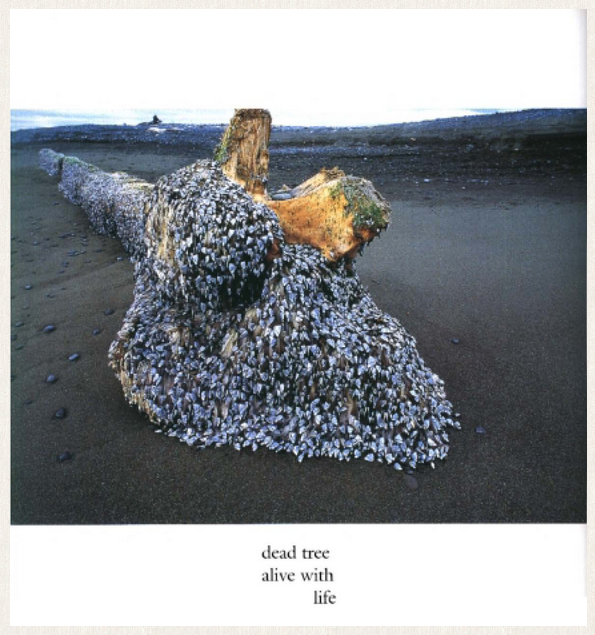
Consider, for instance, this haiga composed of a poem and a photograph. The photograph is by Graeme Matthews, the poem, written to the photo, by Ernest J. Berry. My feeling about this work, and the rest of the volume from which it was chosen (a rainbow, a flowing river), is that the poem feels tacked on here, more a caption than a co-equal partner in creation. Part of the reason for this is that the photograph is completely closed: it draws us powerfully to the “real” objective world, and away from our subjective world of imagination. The photograph, while it conjures things within us, does not require us to go beyond it for greater depth or interest. And so we stop there. The poem, coming after the fact of the impact of the visual element, has a great difficulty in holding its own. In fact, I don’t think it’s too much to say that haiga is anti-photography.
But it is not simply a matter, then, of creating openness. Too much openness defeats haiga in quite the opposite way: where there is not some part of seeing defined, then anything might be seen, that is, imagined, and such a work loses the inevitability which is the keen edge that whets us. Let’s go back to the Rothko painting, for instance, and imagine it as part of a haiga. I have chosen several haiku by Tomizawa Kakio, as translated by Hiroaki Sato and appearing in the most recent antantantantant. I have not made any selections based on content here: I chose these poems because they were one-liners and would look well beneath the painting, and because the volume came easily to hand (it was on my desk). Consider, then, these poems in the context of the Rothko painting: “Autumn deep clanking our canteens we eat” “Dead ahead clouds glittering forced to cross a river” “There getting wet rain-red is a hand grenade” “Night bandage smudges with blood geese fly honking” “The trench’s belly blood-red in undulating rains” Certainly there was a bit of serendipity here, since the colors line up so nicely, and you might or might not like any or all of these, but even if you did, it would be hard to argue for any one more than any other beyond your liking. Each poem leads the viewer toward one of many arbitrary interpretations of the painting, none of which is necessarily any more valid than any other. This is merely the random juxtaposition of elements, made possible because the visual element is so open that it easily contains all these poems, and would contain millions more. The field here is one given completely to seeing, and it is inexhaustible, but this is not an argument for any one of the resulting combinations as a successful haiga.
This is a very fine thing to gauge, this degree of closure. And it is the central issue the creator of haiga must consider in order to succeed in his work. Almost certainly two sharply limned elements will fight one another, or at least invite the intellect to choose between them for superiority. This takes the viewer immediately out of the mindset necessary to enter the experience of the work. This is particularly true if it is the painting that is too accomplished, since it will predominate the initial response to the work.
Which is not to say that painters of haiga don’t have to be highly skilled: they must be good enough to accomplish without overstating, and to judge the sort of interaction their image will have with the text. They must be good enough to realize the effect their work will have on the viewer, and then be accomplished enough not to overwhelm, or especially, close the imagination. And they must still create work of visual interest.
The most successful haiga, then, are those pieces which can manage this. Let’s consider, then, the strategies which creators of haiga generally employ. If, as we have said, the visual element predominates during the first glance, then there are basically two tactics available to the artist: the first is representational, and the second is non-representational. In the first, the visual element is easily understood at a glance or at least with some minimal attention. It needs to be attractive enough to induce the viewer into looking at the poem, but not so finished as to end the discussion all by itself. In the second, the visual element is not clear, and the array of picture and poem suggests, in most instances, that the text might be consulted to clarify. Still, it must be of sufficient interest that the poem not seem informational or a caption.
The first example is by perhaps the greatest master of the form.
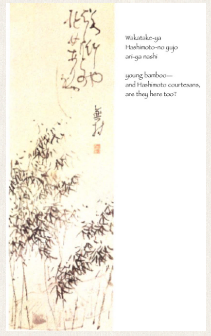
Buson was an extremely accomplished artist. He was more than capable of creating visual art that was entirely self-sufficient in capturing the attention of an audience. But he was also a great haijin, and in his interest in developing both arts, he was able to adjust the balance of the two as no other artist before or since. This example is somewhat typical of his work, neither his best nor worst attempts. It is instructive to see how he manages to make this slight poem, and this sketchy drawing, work together as a cohesive whole. The poem “young bamboo / and Hashimoto courtesans, / are they here too?” is really little more than a conventional metaphor. And the drawing, again a somewhat stylized rendition of a traditional theme, the sprouting bamboo of spring, is no great effort considered against his entire oeuvre. But the glue which binds these two conventional elements and pieces together is his barely suggested hut, a few sketchy lines which seem almost hidden even in this sparse growth. The bamboo, the hut, the direct metaphor of the poem, can all be seen as representational. No effort is made to suggest anything but the direct experience. And yet, as Buson represents it, there is a reticence and mystery which arises, and more to these conventions that meets the eye. What it is is hidden from us, hidden by the very convention itself, which the artist suggests in a most delicate way.
The second, the non-representational strategy, walks the tricky ground that we encountered when we played with the Rothko painting. It needs to be visually interesting, but not closed. And it needs to be sufficiently closed so as not to admit unlimited numbers of poems to accompany. Look at this unusual painting, and try not to read the poem before figuring out what the image is. Even after reading the poem-no color or scent / when flower viewing- / stuffy nose- it’s not absolutely certain what we’re looking at. Is it a nose? If it is, I would agree it’s a stuffy one. But it might be something else, and the title, Self Portrait, would tend to make us think it might be something more than just a nose. It is the non-representational aspect of this image that pulls us in, and makes us seek out the poem. At the same time, there is nothing else in the painting other than the poem and the poet’s signature, so it certainly is not closed: we can imagine all sorts of things, we can enjoy the humor of the poet’s predicament, and we are left with a bit of a puzzle and a sufficiently open juxtaposition to allow us to feel both a participant and an observer. Looking and seeing.
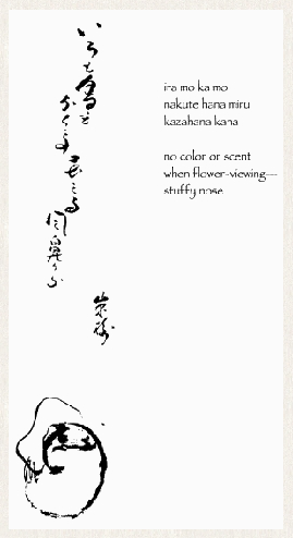
This is the critical element in how haiga work. It is not enough to have technical skill in either or both of these art forms, it is also important that the artist be able to manage them both to permit the audience a way to participate in the work, and at the same time limit the number of possible satisfactory juxtapositions. We’ve already seen 2 very different strategies to accomplish this, and both of these strategies employ their own tactics to achieve their aims.
There are three basic models which the creator of haiga has at his disposal. Each of which has its merits and its difficulties, its usefulness of application as well as drawbacks. These tactics are used in both classical and contemporary work, so it will be interesting to compare them down through the ages.
The first model is that of the poem/portrait. Here the painter, who in classical treatment is sometimes the poet as well but most usually not, offers homage to a poet by presenting one of his verses accompanied by a portrait. This is a powerful political commentary, because such an arrangement can have the effect of legitimizing the poem, the poet, and the artist all at the same time. In this famous example, Buson has painted Basho’s portrait, and appends the following poem: mono ieba / kuchibiru samushi / aki-no kaze (when speaking / the lips turn cold— / autumn wind). This is not a casual sketch, jotted quickly. This is from the tradition of high art, with calculated effects and sure technique. It functions in the way that mainstream art usually functions, by appropriating the symbols of power recognized in the technique and exploiting them.

This is certainly not one of the most famous or revered poems by Basho, but is greatly enhanced by this cleverly planned and powerfully rendered portrait. Basho appears far older here than in any other portraits from any period in his life (and we need to remember that he died at age fifty-one), with the apparent strategy to align with convention of portraying wisdom through agedness. Buson is claiming a spiritual kinship with Basho, and honoring him by painting him wiser, that is, older, than he in fact was. Notice too how the figure of Basho, though dead now for over a hundred years, flows out to more than fill the space. His presence remains overwhelming to the painter even after all these years. The traveling clothes also suggest Basho’s common humanity. And, as the self-proclaimed direct descendant, spiritually, of Basho, Buson claims all these powers for himself as well.
Basho is easily the most popular subject for such haiga. And this is instructive, too, not merely because it tells us that many other Japanese (and other) artists wish to create an alliance with the grand old man of Japanese poetry, but because it also tells us so much about the manner in which haiga is created. It might be argued that portraiture is closed, that it tries to create a fully self-sufficient world around its subject. And yet the variety of portraits of Basho is the most cogent argument against this. He is portrayed as young, old, jolly, stern, well and ill, deep in thought and utterly vapid. Even though it might be argued that portrait haiga is simply a subset of representational haiga, it has been so commonly practiced, and with such variety, it deserves its own place in the history of the form.
Not all portraits are so grand, as we have seen in Shiro’s work, and this one by Issa. The poem attached is: even considered / in the most favourable light, / he looks cold. The sidelong glance which Issa shares with the viewer suggests a puckish humor, as though the inconvenience of cold is not taken very seriously, though at least worthy of his notice, and this casual sketch. In reality, though, this is anything but a casual piece: Issa rewrote this poem at least six times with varying emphases, and also sketched himself in this similar pose at least one other time, not to mention the preliminary sketches he might have tried and discarded. Achieving simplicity is no easy feat.

Issa’s methodology is instructively different from Buson’s. He was in no way a comparable artist, and is wise not to elaborate his sketches. What he achieves, similar to his written work, is a disarming vulnerability, a kind of naïf art where clumsiness is a precondition to eloquence. As the haiga painter Watanabe Kazan states in his Absorption in Pleasure, “With morning glories, the clumsier you paint them, the more pathos they have.” This point of view is critically central to what is most effective in haiga, and Issa is one of the best exemplars of such an aesthetic.
The second model we might call iterative haiga. By this I mean haiga in which the subject matter of the picture and the poem are identical, and are intended to reinforce each other. This is not so simple, again, as it might seem. If either of the elements is powerful enough in its own right, it can render the other extraneous. In fact, this is the most common mistake we encounter in contemporary haiga, especially in the west. But when done well, there can be a building of power, resulting in a heightened experience of the central image.
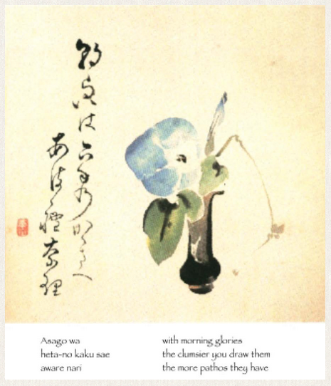
Consider, for instance, the aforementioned Watanabe’s morning glories. The poem can be considered a mere apothegm, or worse, an excuse for a poorly executed painting. But instead, because the painting so charmingly illustrates the point, the art and text reinforce each other, and we are glad for both.
Another example of this is Hakuin’s wren. The poet makes fun of his own inability to paint to a sufficient standard, but in so doing makes a virtue of it. The painting here can be considered artless, but there is still a liveliness which the poem points to obliquely, even while simply recounting what the painting is about.

Both of these haiga, and others equally successful, work because the predisposition we have towards them from the visual is not overwhelming. They are artless, charming, inviting. We are enticed into considering the poem as well, because we know the painting has not said all there is to say of the situation. And once we encounter the poem, we are directed back to the painting through the repetition of theme. These modest paintings carry, as a result, a great deal more energy than they might on their own. Likewise, the poems are saved from preciousness by their associations with art which redeems them. Looking at these haiga does not preclude a further seeing into them.
Both of these examples are representational. We might recall Shiro’s self-portrait as an example of a non-representational picture paired with a thematically linked poem—that is, if we agree it is not a picture of a nose, but of something abstracted.
The final model is tangential haiga, where the art and the poem do not share a theme explicitly, but speak to one another in a glancing fashion, the one opening the other. These are often the most resonant haiga, since the worlds contained in the two elements, not necessarily conjoined in our minds prior to the haiga, are brought together when the two images comment upon one another. Here is Soken’s full moon. The poem reads full moon / my tears are not enough / to praise it, and there are neither moon nor tears present in the picture. But as Stephen Addiss writes about this haiga, “. . . the interactions between the painting and the verse are subtle. They both suggest viewing; while people may enjoy the moon, the crow seems more interested in the fruit. As for the tears, might they be visually suggested by the shapes of the persimmons and leaves? And if so, are there enough persimmons for the birds to praise?”

Add to this the fact that the full moon refers to the harvest moon, and that persimmons require a hard frost to attain their full ripeness and sweetness, which has probably not happened yet— it’s too early— but which should be occurring soon. The objects of the crow’s desire is not ready for consuming, and that’s reason enough for tears; but once ripe, surely tears will not be praise enough. Another excellent example of this threaded sort of connection is Ryota’s charcoal basket. The poem reads looking at the light / there is a wind / this night of snow. But the picture shows none of the image presented in the poem, but rather the charcoal basket, which allows the whole to take on a cozier aspect, a mingling of warmth with the chill. What is more beautiful than watching the freeflight of descending snowflakes when we are comfortably warm? The charcoal basket is casually sketched, and as though aware of its peripheral status in the poem actually falls off the edge of the paper. The hint of wind is caught in the calligraphy, with its sinuous curves and wide vertical spacings. The visual is definitely subordinated to the verbal in this work, but in such a beguiling fashion, and so modestly, that it is easily assimilated into the cosmos limned by the poem, and in fact infinitely deepens it.

Again these are representational examples, but non-representational ones abound. Consider moon by the inimitable Shiro. The moon is nowhere to be found, and the visual element is reduced to a single line to represent the mountain who is the genius of the poem.
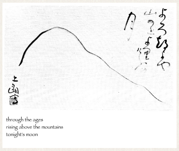
Does the moon illumine the bare outline of this mountain? Or are we waiting for this moon to rise above it, or sink beneath it? It is impossible to say. Much is suggested by this extreme minimalist offering, and the poem is much the better for its accompaniment.
These, then, are the six categories of haiga which have held the interest of poets and painters through the tradition to the present day. Other traditions, such as the animistic painting of creatures acting as humans, widely practiced five hundred years ago, has died out as faith in a literal interpretation in animism has been superseded by more contemporary creeds. The six are, again: representational portrait haiga; non-representational portrait haiga; representational iterative haiga; non-representational iterative haiga; representational tangential haiga; non-representational tangential haiga.
Each of these categories is still utilized today, but as you might expect, each has been updated to include more modern subject matter, tools and techniques. It is not uncommon to find haiga created on the computer, or incorporating unusual materials in the painting, or including modern content in the poems. All these things are essential if haiga is to be a modern form, if it is to be an available form for poets and painters to express their contemporary condition aesthetically. Similarly, the aesthetic which has been identified with haiga, as with haiku, is shifting as painters and poets from more cultures turn their attention to these forms. It is a sign of vitality that the form seems to be able to accomodate these changes without losing its overall shape, and I anticipate that haiga will continue to grow as its best work is exposed to a larger audience in more and different places around the globe. I would like to close with some examples of each of the six categories by artists from some of these various cultures.
To begin, here are a quartet of portrait haiga, ranging from representational to non-representational.

Let it dissolve / my silhouette from behind / into the winter drizzle
The most traditional of these is this portrait of Santoka by the Japanese graphic artist Kuniharu Shimizu. What makes this interesting is the way in which the artist combines the old portrait tradition with contemporary tools and techniques. The photograph is a famous one, but in its new context the image seems utterly refreshed, and the treatment harmonizes nicely with the content of the poem. This is one of a series of haiga which the artist has done on the wandering poet, and the others show equally the novel integration of the old and the new, useful and interesting ways of continuing the tradition, and equally important, creating the future.
One remove from this is my own piece, “after midnight.”
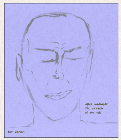
after midnight / the oddness of / my self
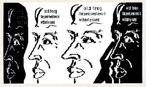
I think one of the most important aspects of this work, in terms of keeping the graphic open and inviting to the viewer to consider the poem as well, is the way the eyes are closed. This creates a suggestion of interiority, which corresponds with the poem’s sense of individual quirkiness as well. The likeness is no worse a likeness, I suppose, than Shiro’s nose. Occupying a sort of middle ground in these is David Gershator’s computer-generated portrait. The artist doesn’t indicate who the picture is intended to be: is it the artist himself? Is it yet another image of Basho? Is it some other person, a cyberperson, perhaps, trapped in the resonance of the old pond reverberating electrons for yet another generation of haiku poets? There are interesting questions about this work which I don’t think can be answered entirely to our satisfaction. And with its now old-fashioned bit-mapped computer graphics, we experience a kind of post-modern wabi where none could have expected it. A most complex piece of art.
The last of this group is even further removed. The subject of the portrait is Jackson Pollock, and the poem reads: mad flicker in eye / pollocks bearish figure plods / rain awakens night. I confess to liking this work more and more as time goes by.
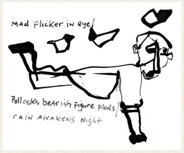
The artist, Guy Beining, does not appropriate Pollock’s style for the portrait, but something chunkier and more object-oriented. It most reminds me of the drawings of Bob Dylan, with its similar unlikeliness of line and oddities of objects and their relationships. And what might have simply been fortuitous, the marker with which Beining adds the poem seems to have been drying up, causing an interesting attenuation of the poem, just as the rain is awakening the night. A very modern sort of portrait in every sense.
We can run the gamut between representational and non-representational iterative haiga as well. Consider, at the front end of that spectrum, Jeanne Emrich’s work entitled winter moon. If the poem was calligraphed in Japanese instead of English we would have no difficulty believing this was a work from the Edo period. It has a beautiful control of the image, suggestive but not overblown, and it links directly with the poem: winter moon . . . / undisturbed snow / on the cabin steps. If this sort of work has a flaw, and it’s a big if, it is that both the painting and the poem draw primarily on the same store of images, and so the one doesn’t appreciably enlarge the other. Nevertheless, a beautiful work.

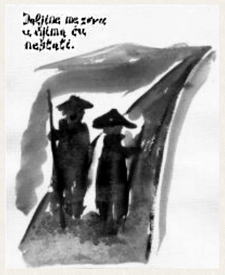
A bit less direct a connection is made in Borivoj Bukva’s haiga daljine me zovu. The figures in the picture, wanderers of the sort we imagine Basho to have been, or more recently, Santoka, might be found as well in Bukva’s native Croatia, hough probably without this sort of hat. The text of the poem translates to: distance calls me / and I’ll disappear / into it. The use of watercolor, and blurring the images as he does here, is effective in this work, an echo of the same fading before the vanishing point which the poem suggests. The looking does not eliminate the seeing here either: the two figures are engaged in some sort of communication, a moment’s pleasantness along the way, but the poem communicates a much more solitary position, where such human contact seems far removed, a luxury rarely to be had.
Stepping, a painting by Susan Frame, poem by Jeanne Emrich, approaches non-representational iterative haiga. Only small portions of the art are recognizably representational, a hint, if you will, but it is enough to ground the picture.
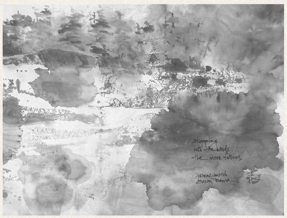
What to make of the blotches and blurs of the rest of the painting is left for the poem to explicate: stepping / into the woods / the moon follows. It is true that the moon seems to be missing from this painting, but perhaps the roundness of the many shapes which Frame finds in this neck of the woods is sufficiently suggestive of it.
It is truly difficult to find a totally non-representative iterative haiga. Almost by definition, if the painting and the poem are going to treat the same subject, the painting must be sufficiently representative that we can know that it is the same theme. A painting that was completely beyond interpretation in some literal sense would also play randomly against any poem paired with it, and so it is unlikely any poem would seem inevitable in such combination. However, it is possible to move pretty far afield toward this unreachable endpoint. Two strategies seem particularly rewarding. Both rely upon suggestibility for their effect.
The first is abstract expressionism. In this haiga, art by Wilfred Croteau, poem by Raffael de Gruttola, the painting considered by itself seems to be primarily about painting, that is, about lines and planes and masses. But in the context of the poem, which reads cracks/of wet stones the/water chain/drips/and/drips, we see that the one has a substantial intersection with the other. Which is not to say that these vertical lines are not the dripping of water. But it is useful to know that the art was produced in response to the poem, and so certainly informed the sorts of choices the artist might make in creating a finished product.
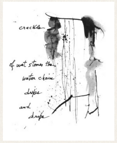
Abstract expressionism is not limited to such a close relationship between the elements, but in its initial attempts, such a correspondence has been the rule. Again, too random a pairing would result, not in relationship, but in arbitrariness, as we observed with the Rothko painting pairings. The truly difficult thing to gauge in attempts at haiga through abstract expressionism is the degree of abstraction which might be allowed and still succeed in creating the inevitability which is the hallmark of great and enduring art.
The second strategy is abstract realism. If we just consider the graphic element in this haiga, one of my own:
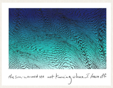
Before you know it is called sun-warmed sea, it might suggest any number of possible interpretations. But paired with the poem, which reads “the sun-warmed sea not knowing where I leave off”, we are placed specifically. And yet not so specifically, since the poem articulates an interior state of identification. The graphic might just as easily be a pictorial version of this unification, a sort of topography of identification. The gradient scale of colors, moving from the warm and fecund sea green to the royal and mystical deep blue also provides emotional latitude for interpretation.
Finally, let’s consider the range of modern possibilities for tangential haiga. By definition we should not expect the art to repeat the theme of the poem; however, we should expect there to be some sort of linkage between the images of the one and the other. Otherwise we would be back to the random pairing of images, and the looking would not lend itself to an inevitable and resonant seeing.
I start with Stephen Addiss’s simple and evocative broom.
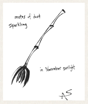
This, too, could easily have come from an earlier time. The poem, motes of dust / sparkling / in November sunlight, is a simple appreciation of the joys of ordinary life, rather reminiscent of the poems of Ryokan. The painting is an unadorned broom. The technique is familiar to us. The pairing is felicitous: I suppose it is possible to say it is a sort of cause-and-effect. And this is nicely gauged, since we experience the broom first, and the poem second: it feels right to come to discover the sunlit motes after having enjoyed the perkily-sketched broom. The airiness we feel from this work is one of its chief characteristics, befitting a celebration of flying dust motes.
Contrast that with the weight of this next work, sesame oil by Arizona Zipper.

my friend from the city / pleased that I’ve sesame oil / in the larder
Working with pencil and magic marker, the artist fills up the available space, and we feel a snugness, which is not oppressive, partly because we can view the lines of the drawing beneath the fill, which have not been adhered to in a very strict fashion. The image, a bird at the birdbath, is refreshing itself. In just the same way, sipping a cool draught from an unexpected source while flying by, the poet has enjoyed a moment of humor in the midst of his life: my friend from the city pleased that I’ve sesame oil in the larder.
The slight smile from the oddity of another’s expectation is the contrasting lightness to the heaviness of the painting, and paralleled neatly in the lightness of the bird.
Almost to the brink of non-representational tangential haiga is Angelee Deodhar’s painting, to one of my poems, rumble.
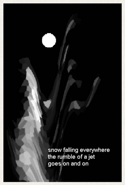
It could be argued that the painter actually visualizes a completely different scene, but one which is contiguous to, or even contained in, the poem. The poem goes: snow falling everywhere / the rumble of a jet / goes on and on. You might expect snow falling in a picture of this poem, but the artist here actually dispenses with it, and instead posits a moon to permit us to see into the depths of a perilous ravine. It is the present snow which permits us to see how steep and precarious it is. And the rumble? Surely a rumble in such country would mean avalanche. So the one conjures the other, and perhaps might even precipitate it. Quite a nice redefining of the locus of the center of attention, with a consequent enlargement of the possibilities of both images.
At last we reach total non-representationality with this final haiga, Zolo’s something I’ll never find.
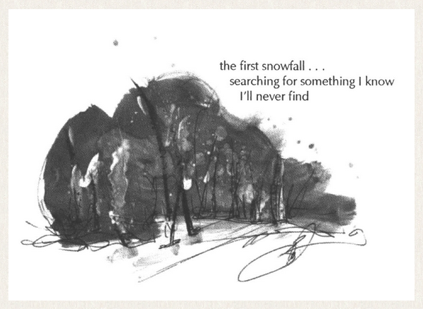
The image is a blur of activity, with some strong features emerging from out of the maelstrom. It is impossible to be certain where we are, but the image suggests nothing to me so much as hairs on the skin, and our vantage point then some extreme close-up of a living body. The poem disabuses us of this idea—but only for a moment. It reads: the first snowfall . . . / searching for something I know / I’ll never find.
So we could be in the woods, but more likely we are in the interior spaces of the artist’s mind, and this is some figurative version of hell, a hell where the only certainty is that of frustration.
That completes our tour of contemporary haiga. As you can see, there is no shortage of possibility in the field, and artists of widely divergent talent, style and intention are exploring it. Perhaps this survey will inspire you to explore it yourselves, if you’re not already doing so. And as you do so, you will be better prepared to know how the form, for all its variety, works in each instance. I hope you have enjoyed seeing these pictures as much as you have enjoyed looking at them.

About the Author

James Michael Kacian is an American haiku poet, editor, publisher, and public speaker. He is the founder of Red Moon Press, the largest publisher of haiku and haiku-related books outside Japan. He is also the founder of contemporary haibun online, and contemporary haibun, a yearly anthology showing some of the best of the year’s published haibun.
This article is from a speech given at the Haiku Society of America’s National Meeting, Xavier University New Orleans, Louisiana, September 2002
It was first published in Simply Haiku 2:5 (Autumn 2004) and reprinted in The Red Moon Anthology of English-Language Haiku, Red Moon Press, 2004, pp. 126-153.
